29 Apr The Psychology of Color: Choosing the Right Colors for Your Headshots
As a headshot photographer, I know that the colors you choose for your headshots can have a profound impact on the viewer’s emotions and perception of you. The colors you use can communicate your personality, brand, and message in subtle but powerful ways. In this post, we’ll explore the psychology of color and how to choose the right colors for your headshots.
The Science of Color
Color perception and the way it affects human emotions is a fascinating area of research for scientists and psychologists alike. In fact, many studies have been conducted to investigate the link between color and human behavior. Here are some more scientific facts, statistics, and studies related to the science of color:
- According to a study by the Institute for Color Research, people make a subconscious judgment about a person, environment, or product within 90 seconds of the initial viewing. Up to 90% of this assessment is based on color alone.
- The same study found that colors can improve brand recognition by up to 80%, making them an essential aspect of branding and marketing.
- A study by the University of British Columbia found that the color red can negatively affect analytical performance, while blue can enhance cognitive performance.
- Another study by the University of Rochester found that the color red can increase the perceived attractiveness of a person or object, but only under certain conditions.
- A study by the University of Texas found that people associate the color green with health and well-being, while blue is associated with calmness and relaxation.
- Researchers at the University of Amsterdam found that colors can affect our mood and emotional state, and that we can even experience physical sensations when we see certain colors.
- In a study by the University of California, San Diego, participants were shown images of different colors while their brain activity was monitored. The study found that different colors activate different areas of the brain, which in turn affects our emotions and behavior.
All of these studies and findings highlight the importance of understanding the science of color when it comes to choosing the right colors for your headshots. By understanding the emotional and psychological effects of different colors, you can make informed decisions about which colors to use and how to use them to achieve your desired outcome.
The Color Wheel
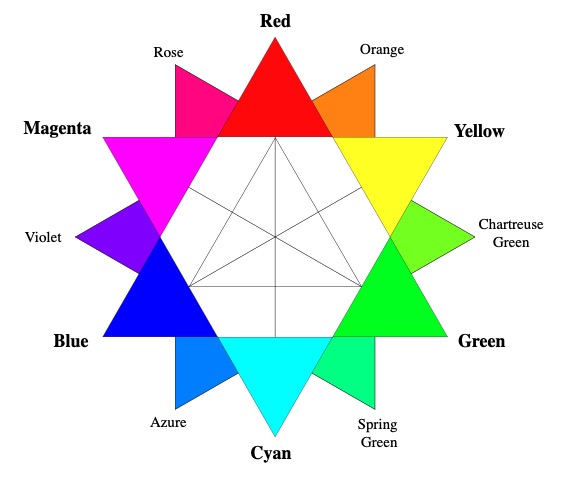
One useful tool for understanding color psychology is the color wheel. The color wheel is a visual representation of all the colors in the spectrum, organized in a circular shape. The three primary colors (red, yellow, and blue) are evenly spaced around the wheel, with secondary colors (orange, green, and purple) in between them.
Each color on the wheel has a unique psychological effect on human emotions. For example, red is associated with passion, energy, and excitement, while blue is associated with trust, reliability, and calmness. Yellow is associated with happiness, optimism, and creativity, while green is associated with growth, harmony, and balance. Purple is associated with luxury, creativity, and spirituality, while orange is associated with enthusiasm, warmth, and playfulness.
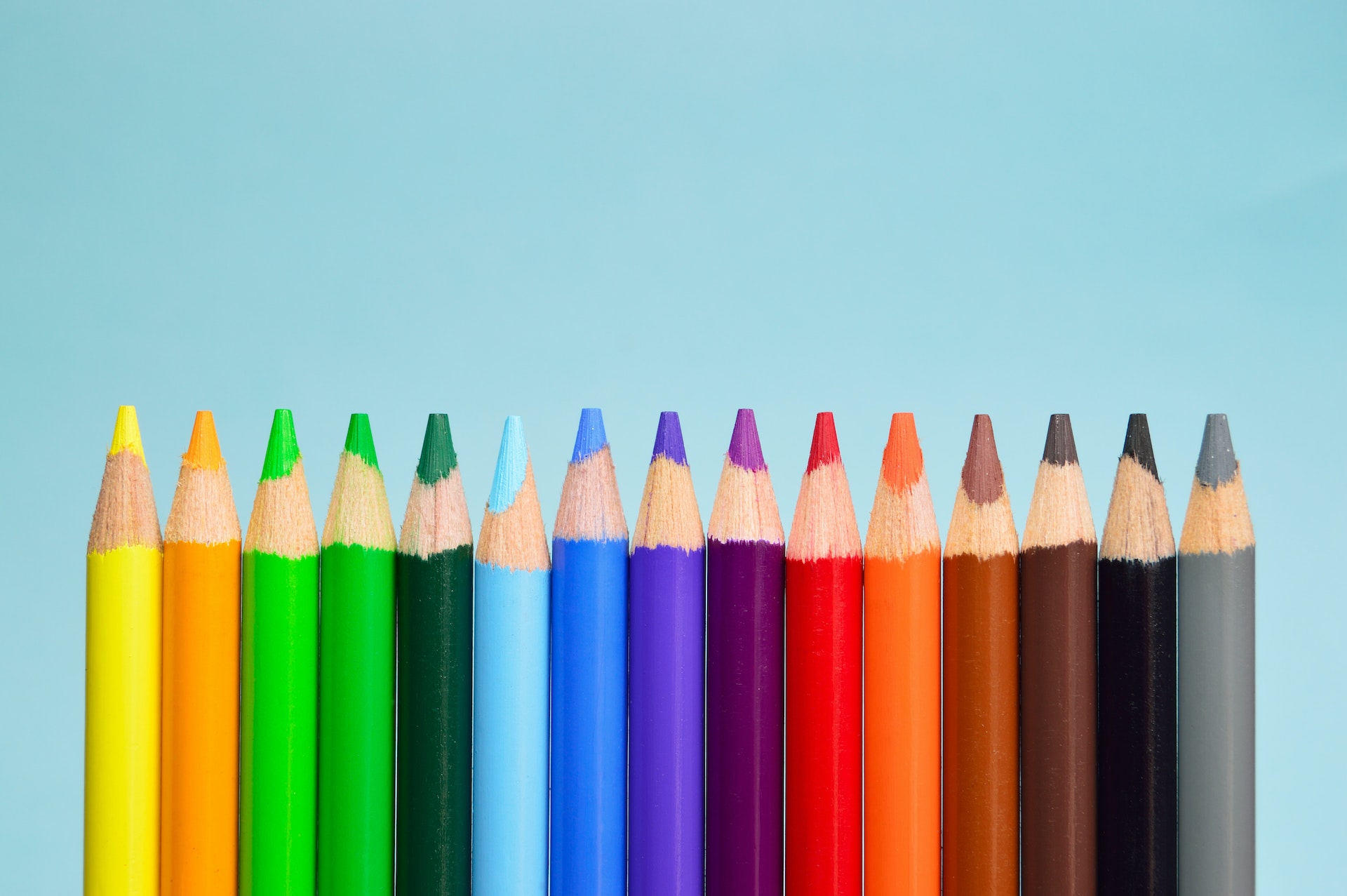
Warm and Cool Colors
Another useful distinction in color psychology is warm vs. cool colors. Warm colors are colors that have a red or yellow undertone, while cool colors are colors that have a blue or green undertone.
Warm colors tend to be more attention-grabbing and emotionally stimulating, while cool colors tend to be more calming and soothing. For example, red is a warm color that can create a sense of urgency and excitement, while blue is a cool color that can promote feelings of trust and reliability.
Choosing the Right Colors for Your Headshots
Now that we understand the psychology of color, how can we use it to choose the right colors for our headshots? The first step is to understand the context of the headshot. Are you using it for a professional profile on LinkedIn or a creative portfolio on Instagram? The context can influence the color choices you make.
Another important factor is branding. If you have a personal brand or business brand, the colors you choose should be consistent with your brand identity. For example, if your brand is associated with creativity and playfulness, you might choose warm colors like orange and yellow to reflect that.
Finally, it’s essential to consider your personality and the message you want to convey. Are you a serious professional who wants to convey competence and trustworthiness? Then cool colors like blue and green might be a good choice. Are you a creative artist who wants to convey a sense of playfulness and originality? Then warm colors like red and orange might be a better choice.
Case Studies
Let’s look at some real-life examples of headshots with different color schemes and their psychological effects.
- Cool Colors: A professional photographer’s headshot with a blue and green color scheme. The cool colors promote feelings of trust and reliability, which is appropriate for a photographer who wants to convey competence and expertise.
- Warm Colors: An artist’s headshot with a red and orange color scheme. The warm colors reflect the artist’s creativity and playfulness, and promote a sense of excitement and enthusiasm.
- Contrasting Colors: A business professional’s headshot with a blue and orange color scheme. The contrasting colors create a sense of balance and harmony while still promoting a sense of urgency and excitement.
In each case, the color choices reflect the context, branding, and personality of the subject.
Conclusion
Color psychology is a powerful tool for communicating your message and personality in your headshots. By understanding the science of color, the color wheel, and warm vs. cool colors, you can choose the right colors to make a lasting impression on your viewers. As a professional headshot photographer, I recommend experimenting with different color schemes to find the one that best reflects your brand and personality.
Remember, your headshot is often the first impression you make on potential clients or employers, so it’s essential to make it count.
Frequently Asked Questions
Q: Can I use multiple colors in my headshot? A: Yes, you can use multiple colors in your headshot, but it’s essential to choose colors that work well together and reflect your brand and personality.
Q: Should I choose warm or cool colors for my headshot?
A: The choice between warm and cool colors depends on your context, branding, and personality. If you want to convey competence and trustworthiness, cool colors like blue and green might be a good choice. If you want to convey creativity and playfulness, warm colors like red and orange might be a better choice.
Q: Can color choices in headshots affect hiring decisions?
A: Yes, studies have shown that color choices can affect hiring decisions. For example, a study by the University of British Columbia found that blue was the most preferred color for interview attire because it conveys competence and professionalism.
Q: How do I know which colors work best for my brand?
A: It’s essential to consider your brand’s values, personality, and target audience when choosing colors. A branding expert can help you identify the colors that work best for your brand.
Q: Can color choices affect online engagement with my headshot?
A: Yes, color choices can affect online engagement with your headshot. For example, a study by HubSpot found that images with a blue dominant color had higher engagement rates on Instagram.