02 Mar The Psychology of Color in Headshot Photography
Headshot photography is a crucial element in many fields, from corporate to entertainment. It’s the first impression that someone has of you or your business, and as the saying goes, “you never get a second chance to make a first impression.” In headshot photography, color can make or break the image, evoking emotions and feelings, reflecting personality and brand identity, and influencing the viewer’s perception of the subject’s competence, trustworthiness, and likability.
The Power of Color in Headshot Photography
Colors can evoke strong emotions and feelings, whether it’s excitement, warmth, or serenity. As a headshot photographer, understanding the psychological impact of colors is crucial to creating a successful and impactful image. Colors can also reflect the subject’s personality and brand identity, setting the tone for the overall image. However, using the wrong colors can detract from the image, making it appear unprofessional or even untrustworthy.
The Pros and Cons of Color in Headshot Photography
Using color in headshot photography has its pros and cons. On one hand, color can add vibrancy and personality to a photo, making it more visually appealing and memorable. On the other hand, color can also be distracting or clash with the subject’s features, taking away from the overall impact of the image.
One of the biggest pros of using color in headshot photography is that it can emphasize specific features of the subject. For example, a pop of red lipstick can draw attention to the subject’s lips, or a blue shirt can complement the color of the subject’s eyes. Additionally, color can convey a sense of personality and emotion, making the subject more relatable and approachable.
However, there are also cons to using color in headshot photography. For instance, color can be too trendy and quickly become dated, which can be a problem for professional headshots that need to be relevant for several years. Moreover, color can clash with the subject’s skin tone or clothing, making them appear washed out or unflattering. In some cases, color can even be distracting, drawing attention away from the subject’s face and towards the surrounding environment.
Despite these potential drawbacks, many headshot photographers choose to use color in their images. By carefully selecting colors that complement the subject’s features and clothing, and by using color in a way that enhances rather than detracts from the overall image, photographers can create compelling and memorable headshots that capture the subject’s personality and brand identity.
The Psychology of Color in Headshot Photography
Warm colors like red, orange, and yellow, convey a sense of energy, passion, and excitement. They can also create a feeling of warmth and friendliness. Cool colors like blue, green, and purple, convey calmness, tranquility, and relaxation. They can also create a sense of professionalism and stability. Different colors also have cultural and social meanings, which can influence the viewer’s perception of the subject’s competence, trustworthiness, and likability.
Choosing the Right Colors for Headshot Photography
When choosing colors for headshot photography, it’s essential to consider the context and purpose of the photograph, as well as the subject’s features and skin tone. Colors that complement the subject’s features and skin tone can enhance the overall image, while colors that clash can detract from it. Using colors that reflect the subject’s personality and brand identity can also set the tone for the overall image.
Understanding Color Theory for Headshot Photography
Ah, color theory. That’s the fancy term for understanding how colors work together, and boy, does it come in handy for headshot photography! Let’s dive into the colorful world of understanding color theory for headshot photography.
First off, let’s talk about the basics. There are primary colors, like red, blue, and yellow, and you can mix them to create secondary colors, like purple, green, and orange. Easy enough, right? But it gets more complicated. There are warm colors, like red, yellow, and orange, and cool colors, like blue, green, and purple. Warm colors can create a sense of energy and excitement, while cool colors can create a sense of calm and serenity.
Now, let’s get into some fancy terms: complementary and analogous color schemes. Complementary colors are opposite each other on the color wheel, like red and green or blue and orange. When you use complementary colors in a headshot, it can create a striking contrast and make the subject pop. On the other hand, analogous colors are next to each other on the color wheel, like blue and green or orange and yellow. When you use analogous colors in a headshot, it can create a cohesive and harmonious image.
But wait, there’s more! Color temperature is another important aspect of color theory. Warm colors, as we mentioned earlier, can create a sense of energy and excitement, while cool colors can create a sense of calm and serenity. This is where you can really play with the mood and emotion of a headshot. Want to convey warmth and approachability? Use warm colors. Want to convey professionalism and sophistication? Use cool colors.
So, why does all this matter? Well, using color theory effectively can make a big difference in the impact of a headshot. It can help you create a cohesive and harmonious image, make the subject stand out, and convey a specific mood or emotion. Plus, it’s just plain fun to experiment with different color combinations!
So go forth, headshot photographers, and embrace the colorful world of color theory. Just remember, with great power comes great responsibility…to create stunning and impactful headshots, of course.
Using Color Theory to Enhance Headshot Photography
Using color theory effectively can make a significant impact on the overall image. Tips for using color theory include considering the subject’s skin tone and clothing when selecting colors, using color theory to create a mood or convey a message, and experimenting with different color combinations to find what works best for the subject and context. Examples of color theory in headshot photography include using complementary colors to make the subject stand out, using analogous colors to create a cohesive and pleasing image, and using color temperature to convey warmth or coolness.
Frequently Asked Questions:
- Does the color of clothing really matter in a headshot?
Yes, the color of clothing can have a significant impact on the overall image. It’s important to choose colors that complement the subject’s skin tone and enhance their features. Avoid colors that clash or detract from the subject’s appearance. - Can the background color affect the perception of the subject in a headshot?
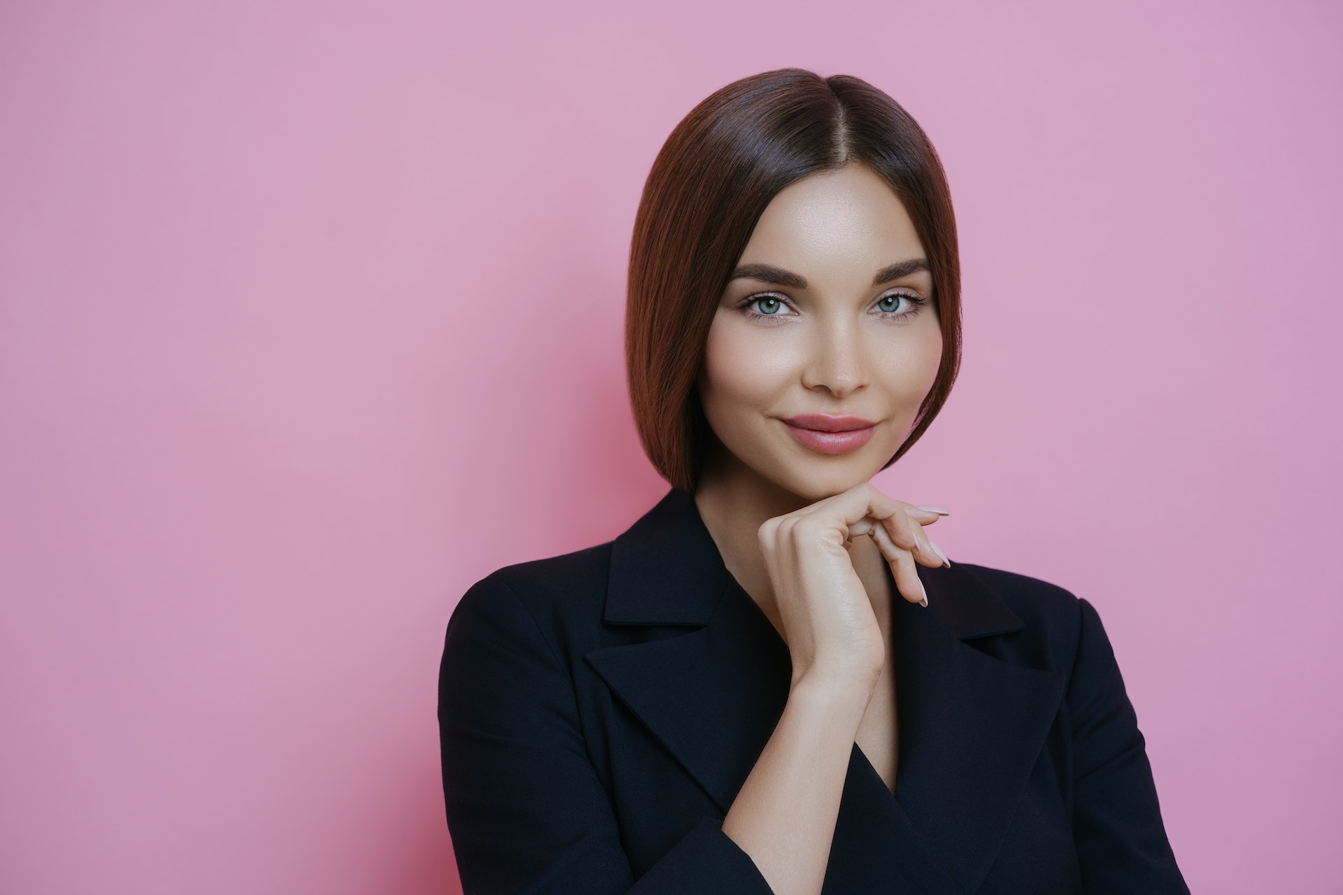
Absolutely. The background color can influence the viewer’s perception of the subject’s personality and competence. For example, a neutral background like gray or beige can convey a sense of professionalism, while a bright or bold background can add interest and personality. - What are some common color choices for headshot photography?
Neutral colors like black, white, and gray are popular choices for headshot photography because they are timeless and versatile. Other colors like blue and green can convey a sense of trustworthiness and calmness. Bright colors like red and yellow can add energy and excitement, but should be used sparingly. - Should a headshot photographer consider the cultural or social meanings of colors when selecting them for a shoot?
Yes, it’s important for a headshot photographer to be aware of the cultural and social meanings of different colors. For example, in some cultures, red is associated with luck and happiness, while in others it can be seen as aggressive or dangerous. It’s important to choose colors that are appropriate for the subject and context. - How can a headshot photographer use color theory to create more effective images?
Understanding the basics of color theory, such as complementary and analogous color schemes, can help a headshot photographer create more interesting and cohesive images. By selecting colors that complement the subject’s features and convey a desired mood or emotion, a photographer can create a more effective and impactful image.
Remember, as a headshot photographer, it’s important to consider the impact of color on the overall image. By carefully selecting colors that enhance the subject’s appearance and convey the desired message, you can create powerful and memorable images that stand out in a competitive market.